
Why: Headings provide structure and help screen readers navigate content.
How: Use built-in heading styles (e.g., H1, H2) rather than changing font size or making text bold.
Accessibility Best Practices for Digital and Course Content
Improve Usability and Inclusion with Accessible Design Tips
Make your websites, course materials, and communications more accessible for everyone. Follow practical best practices for designing content in various platforms, including Canvas, Word, PowerPoint, PDFs, emails, social media, and video. Enhance usability for all users and better support individuals with disabilities.
Why: Headings provide structure and help screen readers navigate content.
How: Use built-in heading styles (e.g., H1, H2) rather than changing font size or making text bold.

Why: Alt text conveys the purpose of an image to users who cannot see it.
How: Describe what’s important about the image in context. Mark decorative images as decorative in the alt-text toolbar.
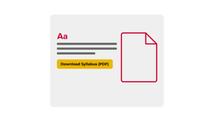
Why: Screen reader users often browse links out of context.
How: Avoid “click here” or “read more.” Use clear, specific text like “Download course syllabus (PDF).”

Why: Layout tables confuse screen readers and mobile users.
How: Use tables only for structured data. Include column/row headers and avoid merged cells.
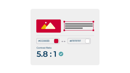
Why: Low contrast and color-only cues can make content hard to read or understand for users with visual impairments, including color blindness.
How: Use a minimum 4.5:1 contrast ratio (check with a contrast tool). Reinforce color with icons, text labels, or patterns.
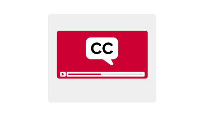
Why: Captions and transcripts support Deaf and hard-of-hearing users—and benefit everyone.
How: Use Kaltura or YouTube auto-captioning and edit for accuracy. Provide text transcripts for audio.
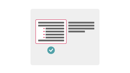
Why: PDFs and Word docs need a structure to be screen-reader friendly.
How: Use styles for headings/lists, avoid images with text, and run the built-in accessibility checker.
How Do You Support Students?
Choose the option that best describes your role to find tailored guidance and resources.

Accessibility Guides, Tools, Training, and Support
From quick-start guides to policy checklists and FAQs—everything you need to build accessible learning environments in one place.